
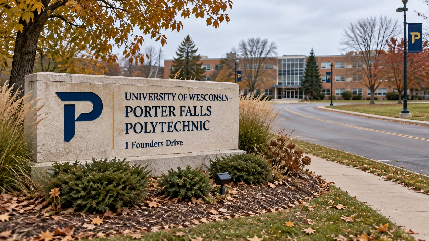
The core palette
Porter navy (#0B2545) and Porter gold (#C9A227) are the two colors that must appear on anything bearing the university's name or mark. A near-white background and a dark ink for body text round out the working set; a short list of accent colors is approved for charts and category tags but is never used for the wordmark, the P, or the Ironclads mark itself. Do not substitute a close-but-different navy or gold from a template or a printer's default swatch — ask for the exact values rather than eyeballing them from a screenshot.
Typography
Headlines and the institutional wordmark use a serif display face; body copy and navigation use a condensed sans-serif for headings with a humanist sans for running text. Athletics materials use a separate, bolder athletic wordmark treatment for "Ironclads" — the two systems are not interchangeable, and mixing them (the institutional wordmark on a jersey, the athletic mark on an admissions letter) is the single most common brand mistake the office corrects.
The marks, and clear space
The primary mark is the P monogram; the secondary mark is the full "University of Wesconsin–Porter Falls" wordmark; the athletic mark is the Ironclads P. Each has a minimum clear space (roughly the height of the P itself) that must stay free of text, photos, or other logos, and a minimum size below which the mark is not used at all because fine details stop reproducing. Never stretch, recolor outside the approved palette, add a drop shadow or outline, or rebuild the mark from a screenshot — always start from the supplied files.
Getting approved files
Recognized student organizations and university departments can request the current logo package (vector and raster formats, in navy, white, and single-color versions) at no cost through the request form linked from this page; most requests are filled within a few business days. Anything intended for sale or outside commercial use additionally needs sign-off under trademark & logo licensing — this page covers correct usage once you already have permission to use the mark, not whether you are allowed to.
Common mistakes
The office's most common corrections, in order: using an old or unofficial version of the P found online rather than the current file; placing the mark on a busy photo without enough contrast; mixing the institutional and athletic wordmarks; and recreating text in a similar-but-wrong font rather than requesting the actual files. When in doubt, ask before printing or publishing — corrections after a print run are far more expensive than a quick review beforehand.
Questions?
See the full staff & office directory for any phone number or email. Because this is a fictional parody site, addresses and phone numbers are illustrative and do not reach a real university.